Claire Brancotte
Graphiste indépendante
À Propos
Graphisme Cinéma
Peintures
Contact
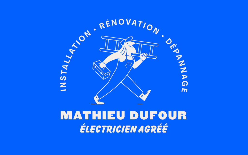
Mathieu Dufour — Électricien
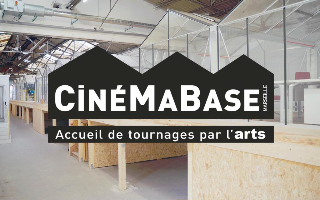
CinéMaBase & ARTS
ECKLOR — Architecture écoresponsable
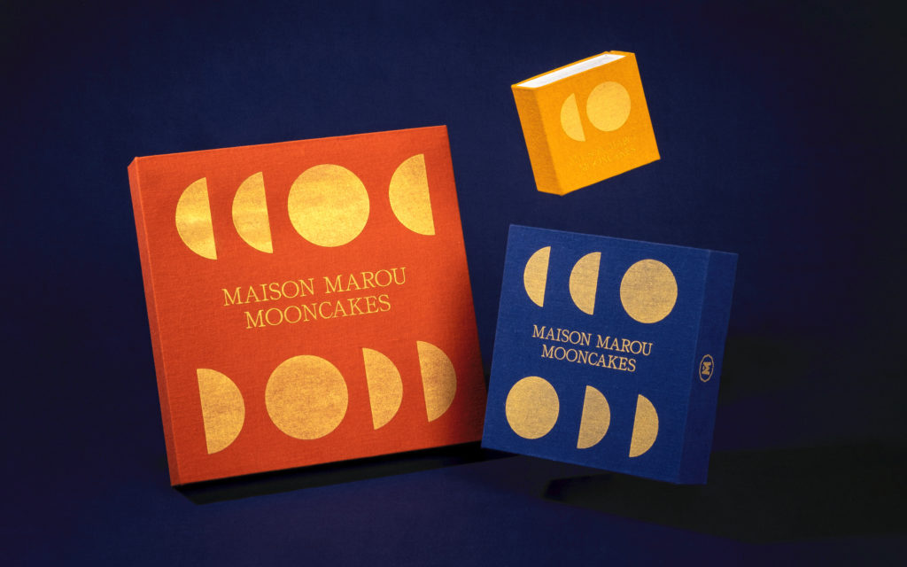
Maison Marou — Fête de la Lune
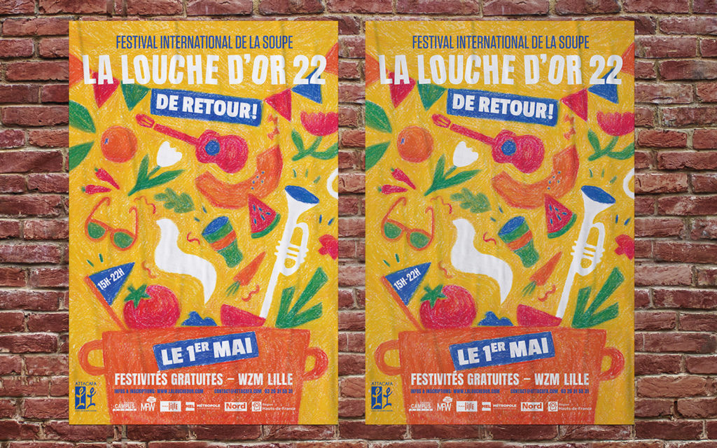
La Louche d'Or
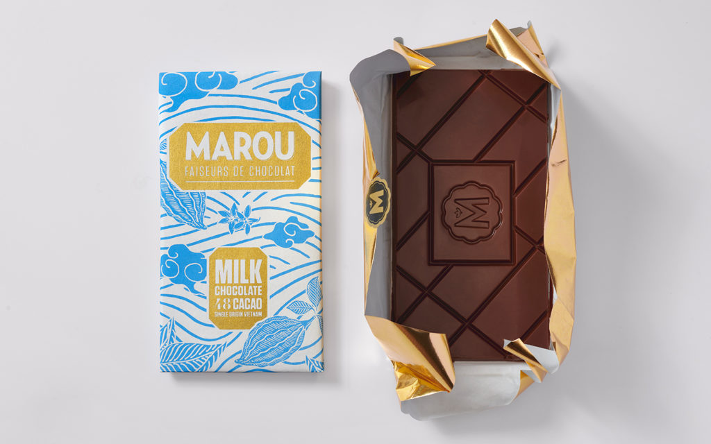
Milk by Marou
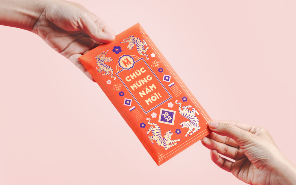
Maison Marou — Nouvel an Lunaire
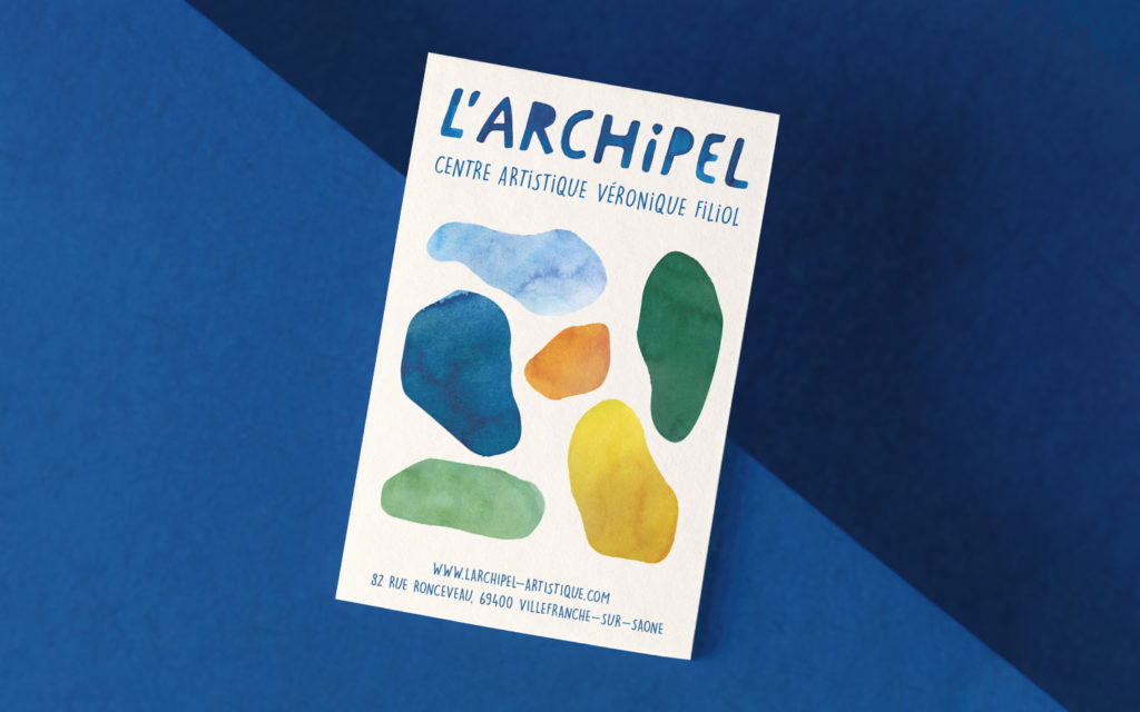
L'Archipel
Maison Marou — Pâques
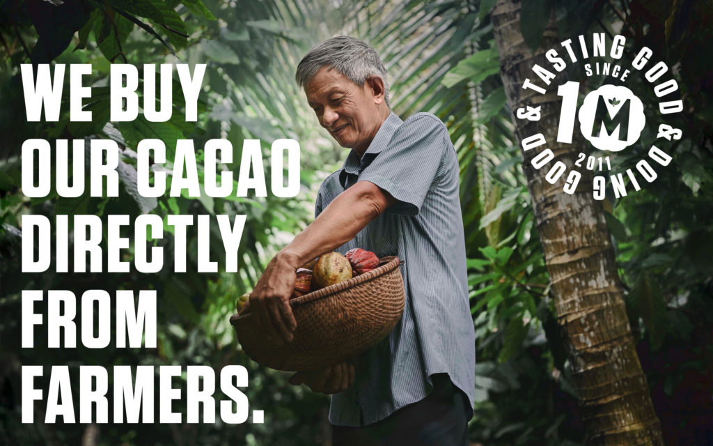
Tasting good Doing good
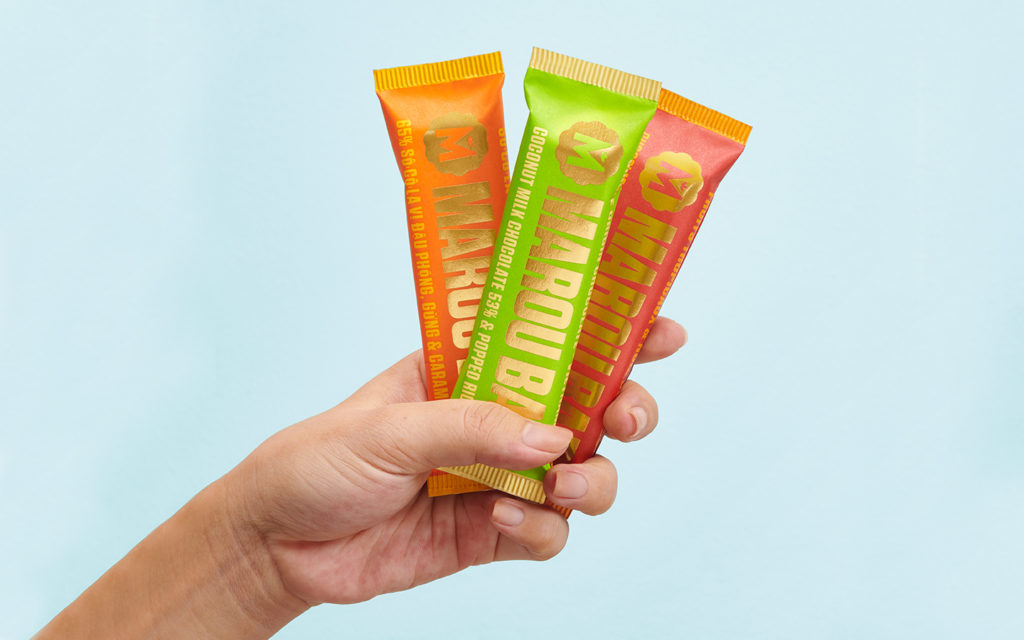
Maroubars
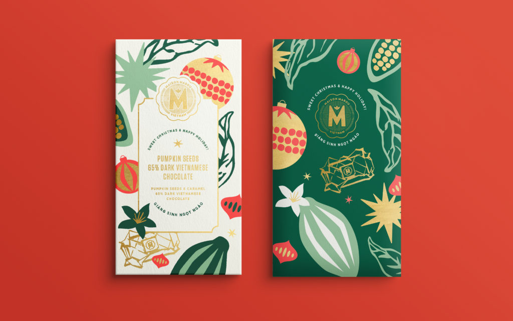
Maison Marou — Noël
Maison Marou — Halloween
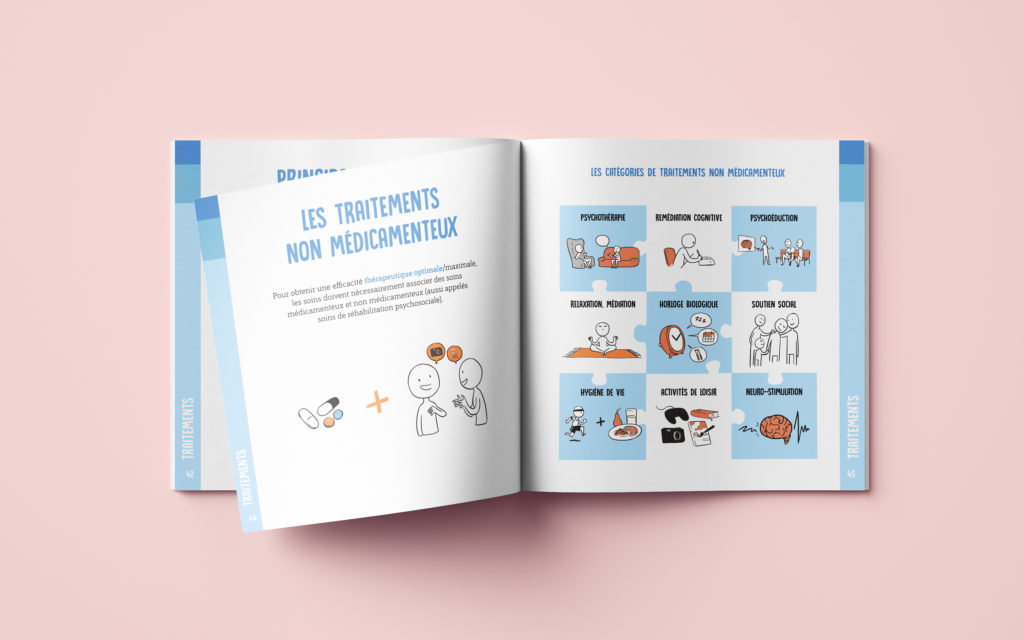
LÉO — Programme de psychoéducation
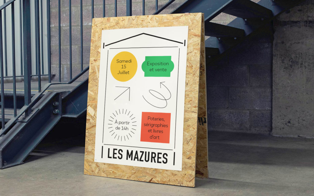
Les Mazures
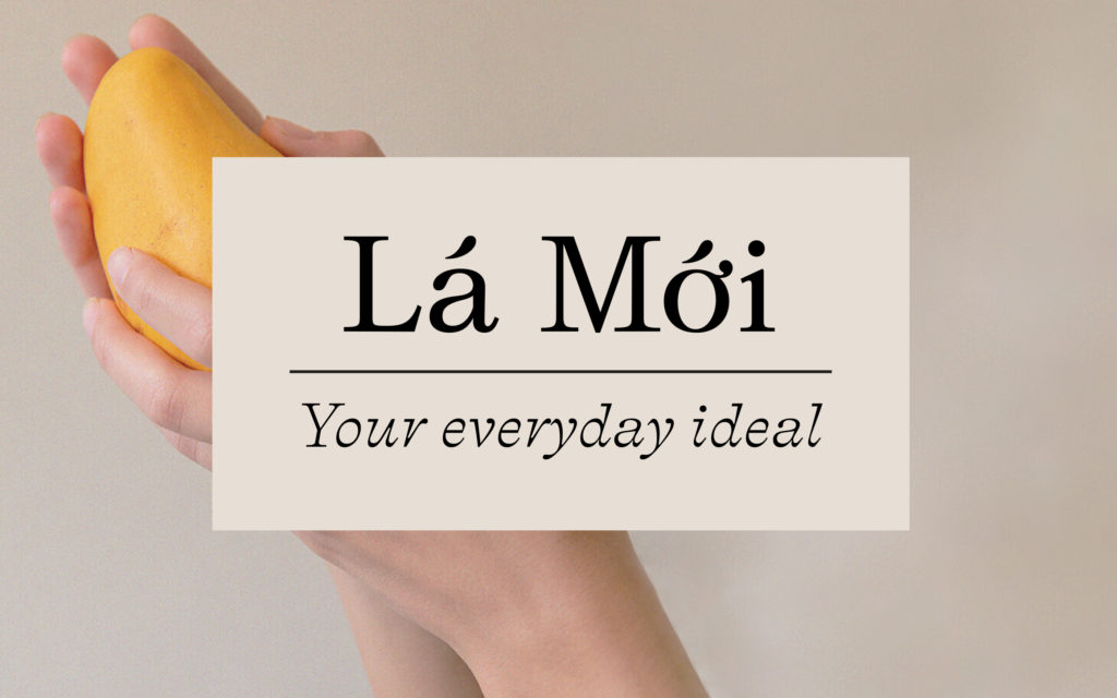
Lá Mới
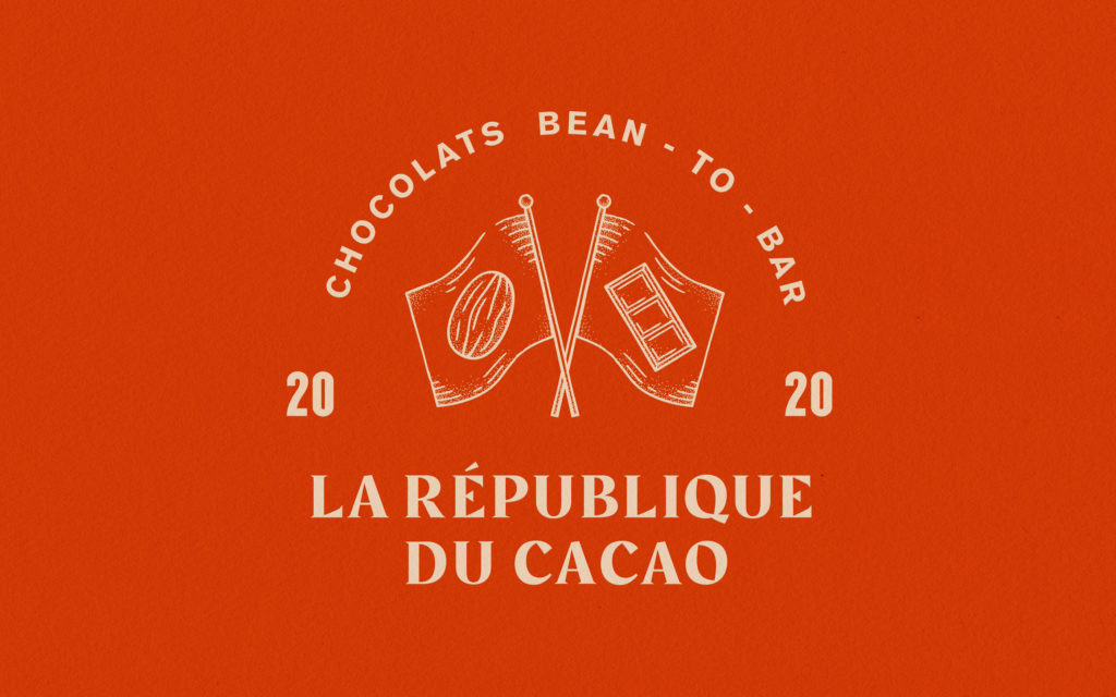
La République du Cacao
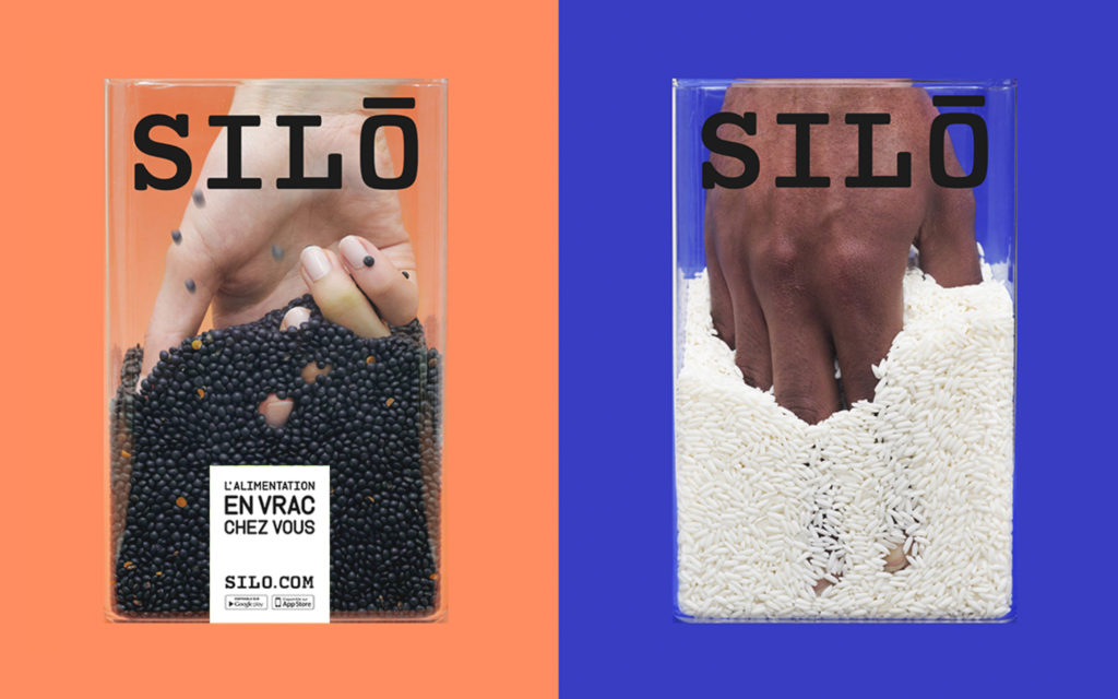
SILO
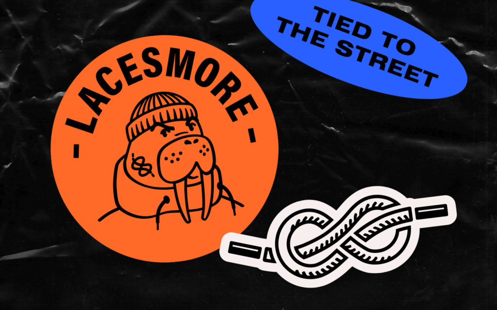
Lacesmore
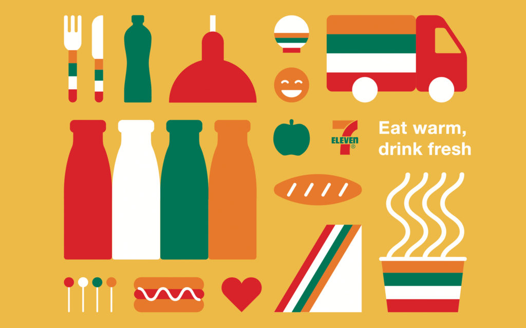
7-Eleven
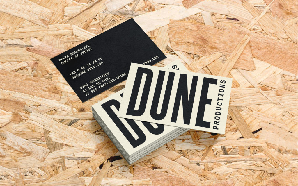
Dune Productions
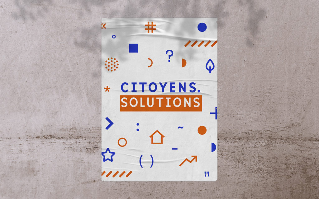
Citoyens.solutions
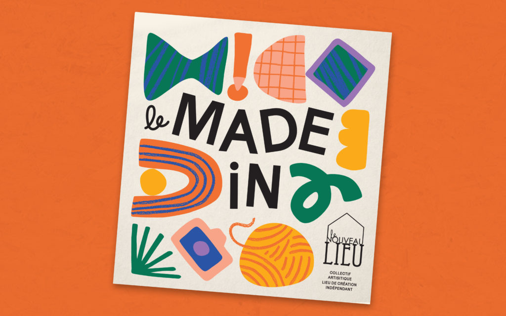
Le Nouveau Lieu
Discovering Oporto
©clairebrancotte2024